Hokusai - The Great Wave off Kanagawa (c.1832): The Print Behind the Wave
Updated: Aug 13
If you searched 'Hokusai - The Great Wave off Kanagawa', this is the print. A horizontal landscape, roughly 25 by 37 centimetres, printed from carved cherrywood blocks in the workshop of the publisher Eijudo in Edo (now Tokyo) around 1830 to 1832. In the foreground a single giant wave rears up with its foam edge curling into long white finger-claws; three thin fishing boats slip down its slope, their oarsmen pressed low against the hull. In the distance, far below the wave's crest, the small snow-capped triangle of Mount Fuji holds the centre of the composition. The wave is enormous; the mountain is small. The trick of the picture is that the wave is closer to the viewer.

The print is one sheet from Hokusai's series Thirty-six Views of Mount Fuji, designed and carved between approximately 1830 and 1832. It is widely held to be the most reproduced single image in art history. The signature on the cartouche at upper-left reads in Japanese: 'Kanagawa oki nami ura' (Under the wave off Kanagawa). The same cartouche carries the series title and Hokusai's artist name for the project, which he used during a particularly productive late period in his career.
What the print shows
The scene is a stretch of open water off Kanagawa, the coastal province south of Edo where fast cargo boats called oshiokuri-bune ran fresh bonito from the southern fisheries up to the city market. Three of these boats are caught mid-wave in the foreground. Each carries eight oarsmen pressed flat against the hull, with their heads bowed and their oars folded inward. The boats are not capsizing; they are riding through. The wave is the everyday hazard of the route, not a disaster.
Mount Fuji sits dead centre in the middle distance, perhaps thirty kilometres beyond the wave. Hokusai has miniaturised it deliberately. In the actual geography, Fuji rises about 3,776 metres above sea level and would be the dominant element of any view from this coast. In the print it is a quiet white triangle set low against the horizon, dwarfed by the wave that is in fact a few metres tall and a few hundred metres away. The composition uses perspective compression as a visual joke: the small thing far away is the holy national mountain; the big thing nearby is a wave that will pass in seconds.
The wave itself is built from a hierarchy of curves. The main mass forms a single great arc that breaks toward the upper-left. Within that arc, the foam edge splits into white claws that mirror Hokusai's own brushwork in his hand-painted studies of waves. The dark trough at the centre of the foam echoes the silhouette of Fuji exactly: a small dark triangle set into a small white triangle. The viewer reads them together as a rhyme rather than as two separate elements.
How the print was made
The Great Wave is a multi-block colour woodblock print (nishiki-e). Hokusai drew the original composition on thin paper in black ink. The drawing was pasted face-down on a cherrywood block, the paper was rubbed thin to reveal the line, and a master carver cut the keyblock: the design's outlines stand up in relief, everything else is cut away. Each colour in the finished print required its own separate block, also carved in cherrywood, registered to the keyblock by small pegs called kento. A skilled printer then inked one block at a time, laid a sheet of dampened mulberry paper on top, and rubbed the back of the paper with a flat pad called a baren. Each pass added one colour. The dark Prussian blue that gives the print its weight came from an imported European pigment that had only recently become available in Japan.
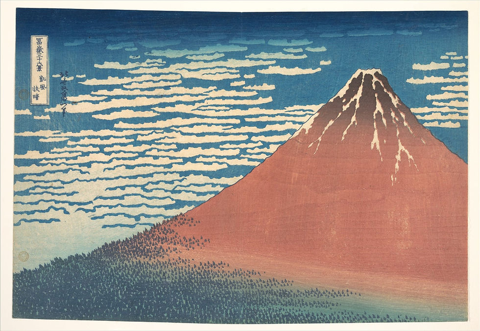
Fine Wind, Clear Morning, shown above (also called Red Fuji in English) is from the same Thirty-six Views series and was printed in the same workshop within a few sheets of The Great Wave. The two are designed to be read against each other. In Red Fuji the mountain takes the entire right half of the composition; the deep blue sky and the dark forested base hold the left. In The Great Wave the same mountain is reduced to a small white triangle at the centre of the horizon, behind a single wave. The series asks the viewer to hold Fuji in mind across thirty-six different framings, and these two are the bookends.
Original Edo-period impressions of The Great Wave were printed in editions of several thousand. Surviving early impressions are held in major Japanese, European, and American collections; the print has been reprinted in various authorised and unauthorised editions ever since. Reference scans now used for fine-print reproductions are taken from early high-quality impressions in public-domain digital archives.
Why Prussian blue
The dark blue of the wave and the sky is the most technically interesting colour in the print. It is Prussian blue (called bero or beroai in Japanese workshop slang, after the German Berliner Blau), a synthetic pigment first made in early-eighteenth-century Berlin and imported into Japan via Dutch traders at Nagasaki. Hokusai had access to it through the publisher Eijudo, who began experimenting with Prussian blue prints in the late 1820s. Before bero, blue in Japanese prints was made from indigo: it faded quickly under sunlight and read as a muted grey-blue rather than a deep ink-dark blue. Prussian blue held its colour, sat deep and saturated next to the white paper, and gave Hokusai a flat plane of dark sky and dark water that earlier ukiyo-e printers could not match. The Great Wave is one of the first Japanese prints designed entirely around the new pigment.
The deliberate use of bero is part of why the print reads as modern. The wave has the visual weight of an oil painting (deep saturated darks, hard edges, controlled gradients) inside the flat compositional language of a woodblock. Earlier ukiyo-e looks like printed line drawing; The Great Wave looks like a painted poster. The technical jump in pigment is part of how Hokusai got there.
Hokusai in 1830
Hokusai was around seventy years old when he designed Thirty-six Views of Mount Fuji. He had been working as a print designer in Edo for over fifty years, had outlived two of his patrons and most of his contemporaries, and had recently changed his artist name (for what was at least the fifth or sixth time) to mark a new phase of work. He signed The Great Wave 'Hokusai Iitsu', a name he used specifically for the Thirty-six Views project. He continued working for nearly two more decades, dying in 1849 at around eighty-eight, and is reported to have said near the end that if he had lived another five years he might have become a real painter.
The Great Wave was a commercial success in his own lifetime. The series sold widely across Edo and reached the European trade through Dutch merchants at Nagasaki within a few decades. By the late nineteenth century, after Japan opened to wider European trade, the print had become one of the central reference points for the Japonisme movement and was studied directly by Monet, Whistler, Van Gogh, and Debussy (who built his orchestral piece La Mer around it). Its appearance on the cover of the first edition of La Mer in 1905 is part of how the image entered global circulation outside the Japanese print canon.
Available as a fine print
The Great Wave off Kanagawa is available as an archival fine print in the ZocineArtDesign shop. Each print is colour-matched against an early high-quality Edo-period impression (the deep Prussian blue brought back to its original saturated dark; the cream paper read against modern archival white) and printed at scale on a heavy archival paper. View the listing here.
Direct link: zocineartdesign.etsy.com/listing/1265846485
How to hang this print
The Great Wave is a horizontal landscape with a deep blue ground, a strong diagonal compositional pull from lower-right to upper-left, and a small focal point (the white triangle of Fuji) sitting on the lower-third horizon line. The hanging logic follows the print.
Wall colour: warm off-white, soft cream, or a pale putty grey. The Prussian blue ground sits against any light warm wall and reads as deep ink. Avoid cold pure white walls (they fight the print's warm cream paper) and avoid deep navy or charcoal walls (they swallow the wave's dark passages).
Frame: a thin natural-wood frame (ash, oak, beech) with a wide cream mat. The print was designed to be looked at as a sheet of paper; a wide mat gives the eye the same breathing room a folio book gives a Japanese print album. Avoid thick black gallery frames and ornate gold frames; both fight the woodblock language.
Light: indirect daylight from any side, or a soft warm picture light from above. The print is not directional in the way a tenebrist oil painting is; it can take light from anywhere as long as it is soft. Avoid hard single-source spotlights, which flatten the layered Prussian blue.
Pairing: The Great Wave pairs especially well with Red Fuji (shown above) at matching frame size. The two are the bookends of the Thirty-six Views series and read as a quiet dialogue: small Fuji behind a big wave, big Fuji under a clear sky. Pair on the same wall at the same height with a shared mat colour and frame. The print also pairs well with single-figure ukiyo-e portraits at matching scale, or with a horizontal landscape from another Edo-period series.
Room: living room above a low sofa, study above a desk, hallway gallery wall, dining wall opposite the head of the table, bedroom above a low headboard. The print works best at a viewing distance of one to two metres so the carved line and the layered colour blocks are visible.
Key takeaways
The Great Wave off Kanagawa is a multi-block colour woodblock print by Katsushika Hokusai, designed and carved in Edo between approximately 1830 and 1832.
It is one sheet from the series Thirty-six Views of Mount Fuji and the most reproduced single image in art history.
The composition is a visual joke about scale: a small mountain (Fuji) sits at the centre of the horizon behind a giant wave that is in fact much closer to the viewer.
The dark blue ground is Prussian blue (bero), a synthetic pigment imported via Dutch traders that gave Hokusai a saturated dark colour earlier Japanese prints could not match.
As a fine print it works best in a thin natural-wood frame with a cream mat, on a warm off-white wall, lit softly, paired with Red Fuji from the same series.
Frequently asked
Is the print really by Hokusai?
Yes. Hokusai designed the original drawing and signed the cartouche on the keyblock. The carving was done by anonymous block-carvers in Edo, and the printing was done by anonymous workshop printers under the publisher Eijudo, which is the standard division of labour in Edo-period commercial print production. The artist of record for any nishiki-e print is the designer; Hokusai is the artist.
Is the famous wave a tsunami?
No. The print is often described in popular writing as a tsunami, but the wave shown is a large open-ocean swell of the kind that fast fishing boats off the Kanagawa coast worked through routinely. A tsunami would not carry a curling foam edge in this shape; tsunamis are long-period low-amplitude waves that flatten coastlines, not breaking surf. Hokusai is showing a steep storm-wave or a wind-driven swell, the everyday hazard of the route from the southern fisheries to Edo.
Why is the print paired with Red Fuji?
Because the two are the structural bookends of the Thirty-six Views series. In The Great Wave, Fuji is reduced to a small triangle behind a large wave; in Red Fuji, Fuji takes most of the canvas as a dominant red-orange cone. The series asks the viewer to hold the mountain in mind across thirty-six different framings, and the two prints anchor opposite ends of the range. Hung as a pair they read as a small private dialogue: the same mountain, seen quietly and then seen loudly.
→ Bring The Great Wave home: zocineartdesign.etsy.com/listing/1265846485
Browse the full archive of fine prints at zocineartdesign.etsy.com.


Comments