Home Office Wall Art: Portraits, Maps, and Quiet Authority
The home office wall is no longer a private space. Since 2020 it has been the backdrop of roughly every video call you take from home. Whatever is on that wall reads, in slightly compressed and slightly off-axis form, to clients, colleagues, interviewers, and whoever else you sit across from on a screen. It is the most-viewed wall in the modern house and almost no one composes it deliberately.
Six approaches that work — each of them rooted in centuries of European convention for what a study or library wall is supposed to look like.

Why the home office is different from any other wall
Three constraints that no other room has. One: the wall is seen at a fixed distance, on a small screen, at a slightly wide-angle distortion (every laptop webcam is roughly 75-90mm equivalent). Two: it is seen against artificial light, almost always cool LED, almost always overhead. Three: it has to read in less than three seconds because that is the attention budget of a person waiting for a call to start.
The composition rules from physical rooms — eye-level hanging, generous mat, frame matching architecture — still apply, but the priorities reverse. On camera, contrast and silhouette do more work than colour. A small framed print at the wrong height reads as clutter. A single large painting at the wrong angle reads as an obstacle.
1. Scholar at work — Vermeer's Astronomer or Geographer
The canonical home office painting is Vermeer's Astronomer (1668). A man in a robe is at a wooden table covered with charts, books, and a celestial globe. Light from a left-side window falls across his hands. He is reaching toward the globe with a careful intelligence. Nothing performs. The painting is the visual definition of quiet authority.
Hung above the desk, behind the laptop, the painting reads on camera as a study within a study. The viewer's eye registers: this person works, this person reads, this person belongs in a room with books. The Vermeer Geographer (a near-identical pendant painting of the same model) does the same job in a horizontal composition.
2. Antique map
A single large antique map — a Mercator, a Blaeu, a seventeenth-century Dutch wall map — reads as authority of a different kind. Geography rather than scholarship. The eye gets drawn into the lines of the continents and the careful lettering of place names. The palette is naturally muted (paper tones, sepia, faded indigo) which reads as warm on a cool-LED camera.
Maps work particularly well behind a centred desk where the viewer's eye finds the map symmetric. Off-centre, they read as decoration. Choose a map whose centre of detail (a continent, a coastline, a famous city) sits roughly behind your right shoulder on camera.
3. Botanical plate — Haeckel, Redouté, Audubon
Ernst Haeckel's late-nineteenth-century natural history plates, Pierre-Joseph Redouté's roses from the Empire era, John James Audubon's birds — all three read as quiet professional taste. The plates are scientific (rigorous classification, careful detail) and decorative (symmetric compositions, soft colour) at the same time.
On camera, botanicals read best in a tight cluster of three to five small framed prints, hung in a vertical or grid arrangement behind the desk. The cluster gives the eye somewhere to rest without dominating any single point. Frame in a single finish — natural maple is the standard — with a generous cream mat.
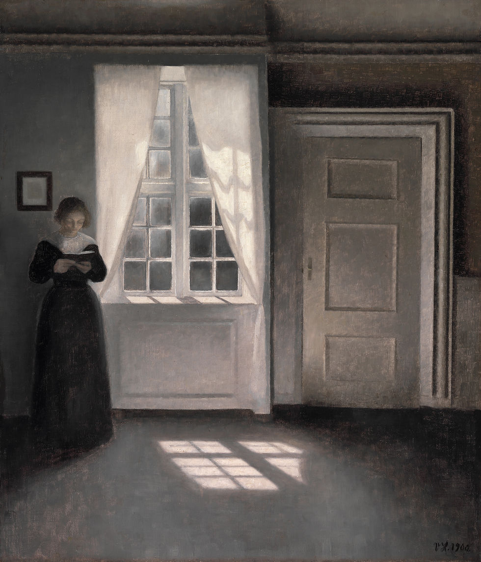
4. Single-figure interior — Cassatt, Hammershøi

A single-figure interior painted in the late nineteenth or early twentieth century — Cassatt at a tea table, Hammershøi in an empty Copenhagen room — reads on camera as composed domestic intelligence. Not the scholar's library, not the cartographer's office, but the quiet room of someone whose work happens to be at home.
These paintings work best when the figure in the painting is facing away from the camera, or in profile. A subject staring out of the canvas (a Sargent, a Velázquez court portrait) competes with the person on the call.
5. Single landscape — Friedrich, Cézanne, Hokusai

A single landscape — Friedrich's Wanderer above the Sea of Fog, Cézanne's Mont Sainte-Victoire, Hokusai's Red Fuji or Great Wave — gives the home office camera a quiet horizon. The eye reads the depth as visual oxygen. The painting becomes the breathing space in the frame.
Landscapes work best when the horizon line in the painting sits at roughly the same height as your eye line in the frame. This requires a moment of measurement before hanging. Most people hang landscapes 10-15 cm too high.
6. Architectural drawing or print
A single architectural drawing — a Piranesi etching of a Roman ruin, a Robert Adam interior, a Schinkel theatre — gives the home office the same authority as a scholar portrait, but in a colder, more austere register. The lines do the work. The colour is restricted to paper tones and one or two pale ink washes.
Architectural prints work well in groups of three to five, hung in a horizontal line behind the desk. The collection reads as a small private museum.
Key takeaways
The home office wall is the backdrop of every video call — the most-viewed wall in the modern house.
Six approaches: scholar at work (Vermeer Astronomer), antique map, botanical plate cluster, single-figure interior, single landscape, architectural print.
On camera, contrast and silhouette do more work than colour. Hang at eye line in the camera frame, not the room frame.
Avoid faces staring directly out of the canvas — they compete with the person on the call.
One large statement painting OR a tight cluster of three to five small framed prints. Never a gallery wall.
Featured prints
Vermeer, The Astronomer — zocineartdesign.etsy.com/listing/1089389806
Cassatt, The Tea — zocineartdesign.etsy.com/listing/1870229593
Friedrich, Wanderer above the Sea of Fog — zocineartdesign.etsy.com/listing/962847872
Hokusai, Red Fuji — zocineartdesign.etsy.com/listing/1858260434
Browse the full archive at zocineartdesign.etsy.com.

Comments