Wall Art for Dental Offices: A Calming Curatorial Approach
- Zocine Art
- 2 days ago
- 4 min read
A dental patient walks into a waiting room with an elevated pulse, slightly faster breathing, and a low-grade dread that goes back to childhood. The art on the wall has one job, and it is not decoration. It is to lower the pulse rate of the person looking at it before the dental assistant calls their name.
This is a problem that has been studied. Hospital-design research consistently shows that representations of nature — open water, soft landscape, north-window light — reduce measured patient anxiety. Bright contemporary abstracts, busy gallery walls, or anything with a strong human figure looking back at the viewer have the opposite effect. The same logic applies, with smaller stakes, to dental offices.
The composition rules
Three rules, before the paintings. One: no faces looking out of the canvas. A direct gaze from a portrait raises social-attention demand on a patient who has none to spare. Two: no high-saturation reds, oranges, or yellow-whites. Warm-end saturation reads as urgency. Three: cool palette, water or air or empty room, low contrast.
The waiting-room wall should hold one or two larger paintings, well-spaced. The treatment rooms — where patients are lying back staring at the ceiling — benefit from a single quiet horizontal painting at sight-line from the chair. Most dental offices get the waiting room half-right and the treatment room wrong (commercial poster, fluorescent backlight, nothing to look at).
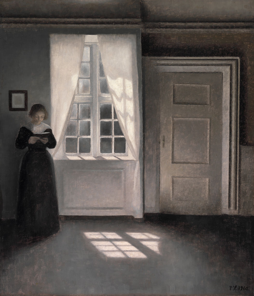
1. Hammershøi — interior calm
Vilhelm Hammershøi's empty Copenhagen rooms are the visual equivalent of a slow exhale. North light on a bare floor, a half-open door, a white wall. The Interior with Sunlight on the Floor (c.1900) above shows the formula at its purest. A dental waiting room with one larger Hammershøi above the seating reads as a small museum gallery, not a clinical antechamber.
2. Monet — water lilies

Monet's late Water Lilies series — painted at Giverny between 1900 and 1926 — has no horizon line, no figures, and no narrative. Just water surface with reflected sky and floating lilies. They were originally painted to be walked into, on huge curved canvases, in a museum room with no other art. A single Monet water-lily print on a treatment-room wall does much of the same work at smaller scale.
3. Hiroshige — Plum Garden at Kameido

Utagawa Hiroshige's late Edo print of plum blossoms in pink against a soft green ground is one of the most-reproduced images in ukiyo-e and has been a fixture in calm interiors for a hundred and fifty years. Van Gogh copied it in 1887. The composition is unusual — the tree trunk runs vertically through the centre of the print — but the colour register (soft pink, pale green, muted black) is exactly right for a waiting room.
4. Whistler — Nocturne

Whistler's Nocturnes — paintings of the Thames at night in fog — are built around blue-grey and pale gold and almost nothing else. The eye reads them as evening light. Hung in a dimly lit treatment room they extend the architecture out into a quiet view. The patient lying back in the chair has something to rest on rather than ceiling tiles.
5. Vermeer — The Milkmaid
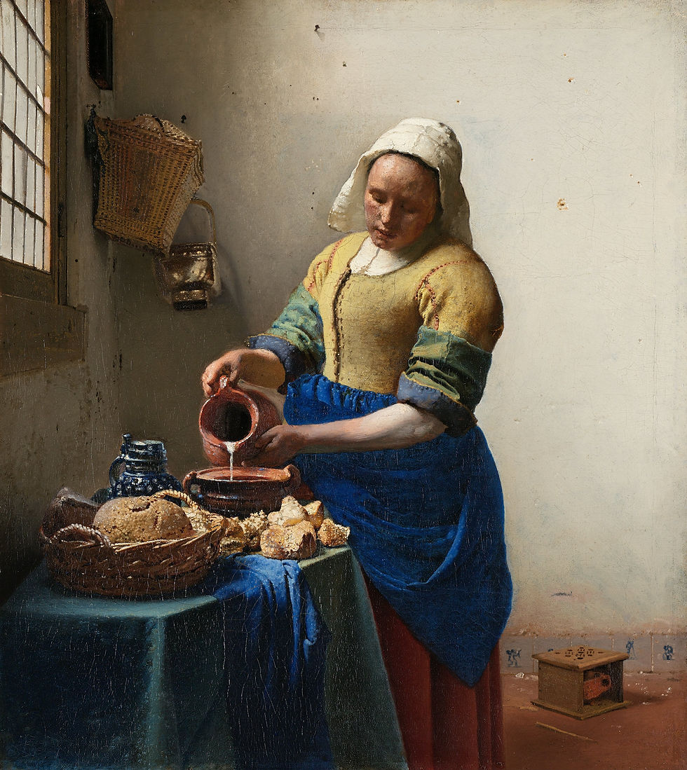
Vermeer's Milkmaid is the rare interior with a single figure that is calming rather than confronting. The maid is in profile, eyes down, fully absorbed in the small task of pouring milk from a jug. The patient's eye reads her concentration as a kind of permission to slow down. The palette is muted — Vermeer's ultramarine apron against a milky-white wall — and the entire scene moves at the speed of slowly-poured milk.
6. Friedrich — a quiet landscape
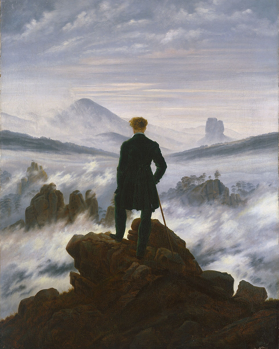
Caspar David Friedrich's Wanderer is the famous one, but his quieter landscapes — chalk cliffs on Rügen, a monk by the sea, a small graveyard in winter — work better in a clinical space. The figures, when present, all face away from the viewer. The horizon is low. The palette is muted blue and grey-brown. A single Friedrich landscape above the waiting-room reception desk reads as a window onto a calmer place than the office actually is.
Composing the office
For the waiting room: one large statement painting (Hammershøi, Friedrich, or Monet) above the seating, plus one quieter painting on the opposite wall (Vermeer or Hiroshige) so the patient's gaze moves slowly across the room rather than fixing on one image. For the corridor: a sequence of three smaller prints at equal spacing — Hiroshige, Whistler, Vermeer — so the walk to the treatment room becomes a small gallery. For each treatment room: a single horizontal landscape at chair sight-line, oriented so the patient lying back sees water or sky, not figures.
Frame everything in the same finish — pale oak or natural maple is the standard for medical-design palettes — so the art reads as a coordinated collection rather than individual decisions. Mat the smaller prints with a generous (8 cm) cream-toned matboard; the white space around each image is part of the calm.
Key takeaways
Dental office art has one functional job: lower the patient's pulse rate before they're called.
Avoid faces looking out, warm-saturation colour, and busy gallery walls. Cool palette, water, soft landscape, empty interiors.
Six paintings carry the brief: Hammershøi, Monet water-lilies, Hiroshige Plum Garden, Whistler Nocturne, Vermeer Milkmaid, Friedrich landscape.
Compose by zone: one large + one quiet in the waiting room, sequence in the corridor, single horizontal landscape per treatment room at chair sight-line.
Use a single frame finish across the entire practice — pale oak or natural maple — so the art reads as one coordinated collection.
Featured prints
Hammershøi, Interior — Sunlight on the Floor — zocineartdesign.etsy.com/listing/1145509895
Hiroshige, Plum Garden at Kameido — see Etsy archive
Whistler, Nocturne in Black and Gold — zocineartdesign.etsy.com/listing/1269609092
Vermeer, The Milkmaid — zocineartdesign.etsy.com/listing/1089363248
Friedrich, Wanderer above the Sea of Fog — zocineartdesign.etsy.com/listing/962847872
For a curated proposal tailored to your specific waiting room and treatment rooms, the consulting service at zocineart.com/art-consulting can scope the full programme.


Comments