Office Wall Art: 6 Classical Prints That Read as Authority Without Trying
Updated: Jun 17
Most offices try to look serious and end up looking corporate. A Vermeer or a Sargent reverses that — the room reads as considered, calm, and quietly authoritative without trying. The right classical print on a study wall says more about a person than any framed certificate.
Six paintings hold an office room better than almost anything else painted in the last hundred years. Here is the brief — what to hang, what size, what frame, against what wall.
What makes a painting work in an office
An office is read across a long workday, often peripherally. The painting needs to settle into the room rather than demand attention. The shortlist below favours three qualities:
Restrained palette. Earth tones, deep umber, ivory, ink, oxidised gold. Nothing that competes with the screen or the wall.
A single quiet figure or a still interior. Avoid crowd scenes, narrative drama, and battle paintings. The viewer should be able to think while it is on the wall.
Pre-twentieth-century technique. Painted on linen or panel, finished with a glaze. The surface is the part that reads as authority — a print that respects the surface reads with the same weight.
Vermeer — The Astronomer (1668)
The single most office-appropriate painting ever made. A scholar at a circular table, hand on a celestial globe, north light coming through a leaded window. Hang above the desk on the wall facing the chair, so the painting reads when one looks up from the screen. Size: 24×30 or 30×40 inches. Frame: walnut, oxidised brass, or matte black with a thin lip. Avoid gilt — too decorative for the subject.
Sargent — El Jaleo (1882)
The horizontal Sargent. A dancer mid-step, lit from one direction by a row of guitarists in shadow. Reads as movement and confidence — the painting that hangs in a partner's office and says the room belongs to someone who has done the work. Best on a long wall behind a sofa or low credenza. Size: 30×60 or 40×80 inches. Frame: oxidised brass or aged walnut.
Velázquez — Portrait of Pope Innocent X (1650)
The most psychologically alert portrait in the canon. Velázquez paints the pope as a man, not a saint — sharp red against deep red, eyes that read the viewer back. Hang on a side wall where it catches indirect light, not facing the desk (the gaze is too direct for sustained work). Size: 24×30 inches. Frame: matte black or ebonised wood. Best in offices with a deep neutral wall — sage, ink, espresso.
Caravaggio — Saint Jerome Writing (1605)
A scholar at his desk, lit by a single source, working alone. Caravaggio painted Jerome as an aged thinker absorbed in his own page. The single best painting for a writer's room or a quiet study. Size: 24×30 or 30×40. Frame: dark walnut or ebonised oak. Hangs best against ivory, oat, or charcoal walls — the chiaroscuro needs a wall darker than itself to read.
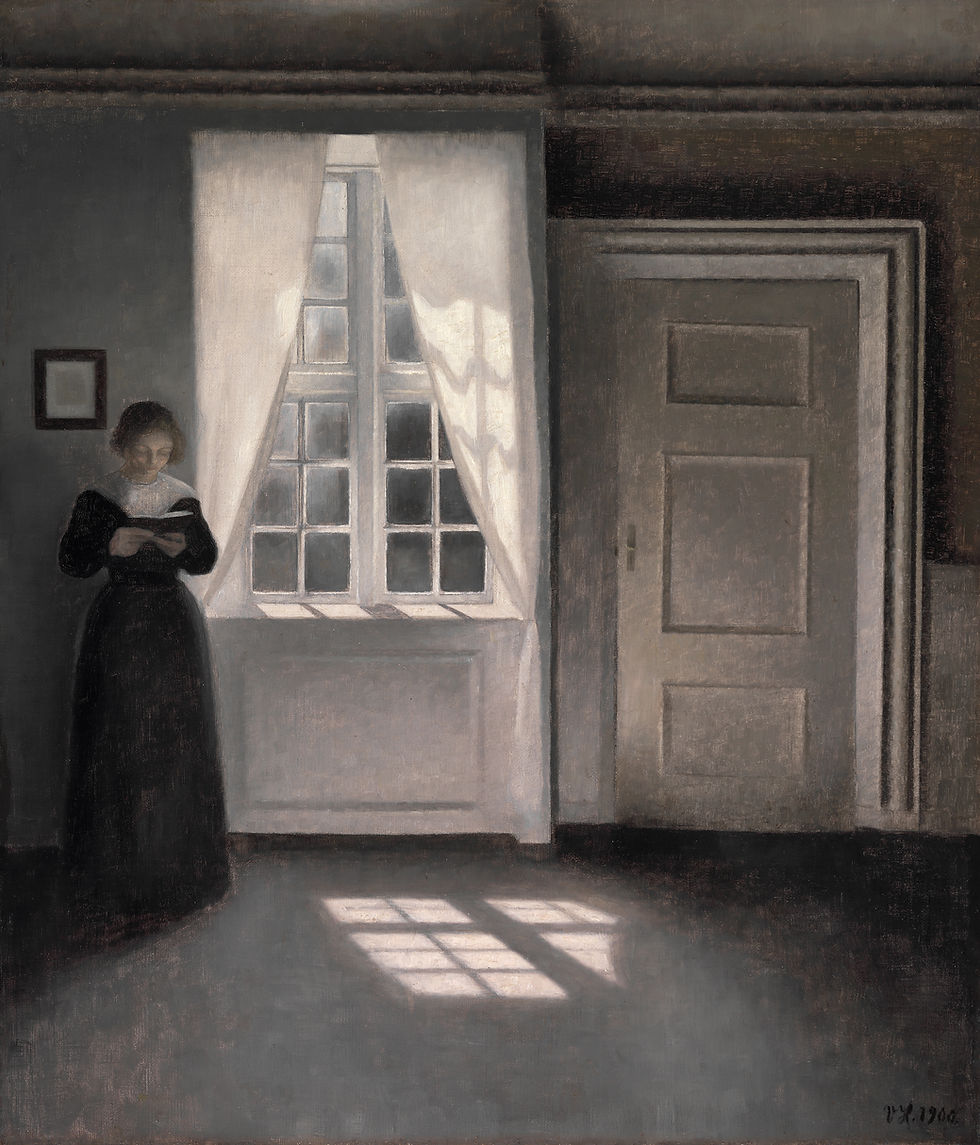
Hammershøi — Interior, Strandgade 30 (1900)
A grey Copenhagen room. A doorway, a chair, an empty surface. Hammershøi painted silence — almost no painter has matched the room's stillness. The most underrated office print in the canon, ideal for a corner where the eye lands during phone calls. Size: 24×30. Frame: pale oak, unfinished ash, or thin matte black. Pairs with linen-white walls.
Whistler — Nocturne in Black and Gold (1875)
Almost-abstract, almost-black, with sparks of gold on a deep Thames night. Whistler called these paintings 'arrangements' and treated them as music. Best on a feature wall in a darker office or behind a partner's desk at distance. Size: 24×36 or 30×40. Frame: thin matte black; the painting wants almost no frame.
Choosing rules
Two structural rules apply to every office anchor.
One painting, not three. An office gallery wall reads as busy on a video call. A single large anchor is what holds the room.
Hang at standing eye level, not seated. Offices are read from the doorway by visitors, not from the chair by the occupant. Hang the centre line at 58–60 inches from the floor, even above a low credenza.
Key takeaways
An office painting should settle into the room, not demand attention.
Single anchor; pre-twentieth-century technique; restrained palette.
Hang at standing eye level (58–60 inches centre), read from the doorway.
Frames: walnut, ebonised oak, oxidised brass, or matte black. Never gilt.
Vermeer, Sargent, Velázquez, Caravaggio, Hammershøi, and Whistler hold a study wall better than almost anything painted in the last hundred years.
Where the prints live
A short list of the anchors that live as fine prints in the archive:
The full archive lives at zocineartdesign.etsy.com.

Comments