Color and Light AI Cannot Reproduce: Five Pigment-Era Lessons from Van Gogh, Vermeer, Klimt, Monet, and Turner
Generative AI image models render colour and light as RGB samples of trained surfaces. Every classical-master painting AI has been trained on was first reduced to a digital photograph, the digital photograph was reduced to a set of pixel-RGB values, the pixel values were embedded into a latent space, the latent space was sampled to produce the output image. Five steps from the master's brush to the AI output, and at every step the actual chemistry of the original pigment was discarded. The classical masters did not paint RGB values. They painted with specific physical pigments that had specific optical properties, applied in specific layered sequences across weeks. The result was colour and light effects that the master encoded chemically, not visually. Below are five specific pigment-era lessons — Van Gogh's cadmium yellow, Vermeer's ultramarine, Klimt's real gold leaf, Monet's broken colour, Turner's white-lead luminance — each demonstrating something the AI image model fundamentally cannot reproduce because the chemistry the master used is not in the training data at all. The fine-print reproduction carries forward what the original encoded. The AI image samples only the surface.

1. Van Gogh, Sunflowers (1888) — cadmium yellow chemistry
Van Gogh's Sunflowers canvases at Arles in 1888 demonstrate the first pigment lesson: cadmium yellow chemistry. Van Gogh used a specific combination of three different yellow pigments — cadmium yellow (introduced commercially around 1840, very saturated, slightly toxic), chrome yellow (lead-chromate, more orange-yellow, less light-stable), and lead-tin yellow (the older Renaissance yellow, paler and more chalky). The three pigments were layered onto the canvas in specific sequences for specific local effects. The deepest sunflower-petal centres are cadmium-on-cadmium for maximum saturation; the petal edges are cadmium over a thin chrome-yellow underpaint for warmth; the wall behind the vase is lead-tin yellow alone for chalky distance. The painting sings because the three different yellows are doing three different things in the same canvas. AI image generators trained on photographs of Sunflowers render all the yellows as a single average-yellow RGB sample (#F5C518 plus or minus minor variation). The result looks Van-Gogh-ish at thumbnail size and looks visibly flat-yellow at print size. The original Sunflowers print at any meaningful size still carries the three-pigment chemistry the AI sample dropped.
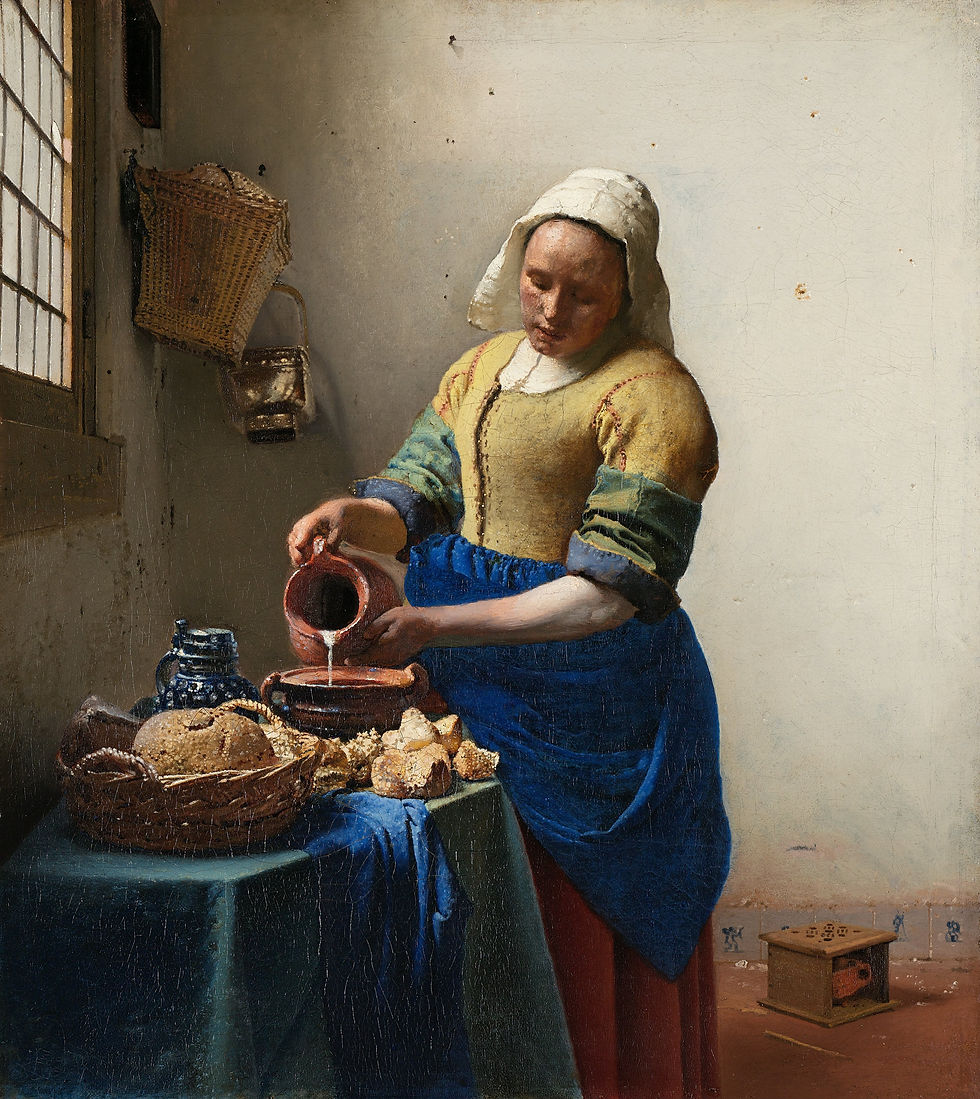
2. Vermeer, The Milkmaid (c. 1658-60) — ultramarine layered optical depth
Vermeer's Milkmaid demonstrates the second pigment lesson: real ultramarine (ground lapis lazuli from Afghanistan) layered for optical depth. Lapis lazuli was the most expensive pigment of the 17th century — Vermeer paid more per gram for it than gold leaf cost the same year. He used it specifically for the milkmaid's apron, layered as follows: first a black-grey underpaint to establish the deep shadow zones; then a thin glaze of ultramarine mixed with lead-white for the highlight passages; then a pure ultramarine over the mid-tone areas; then a final transparent glaze of ultramarine alone for the deepest blues. Four layers, each allowed to dry, each adjusting what the previous layer was doing. The optical result is a blue that light enters, refracts inside, and exits at a slightly different angle than it entered — the apron looks lit-from-inside because the pigment is physically lit-from-inside. AI generators render Vermeer-style blues as flat RGB (#3855AA or similar single-sample). The print buyer who hangs the Vermeer reproduction at any meaningful size will see the layered optical depth surviving the print process; the AI imitation has only the average sample.
3. Klimt, The Kiss (1907-08) — real metal gold leaf
Klimt's The Kiss demonstrates the third pigment lesson: real metal gold leaf. Klimt applied genuine 23.5-carat gold leaf to large areas of the canvas — the kneeling couple's enormous gold-leaf cloak, the gold-leaf flower-field, the gold-leaf halo zones — using traditional gilding techniques inherited from Byzantine icon-making (gesso ground, bole sizing, leaf-application, agate-burnishing). Real gold leaf has specific optical properties: it reflects ambient light selectively, the highlight-zones move as the viewer moves past the painting, the gold can be matte-burnished or shine-burnished for different surface effects, and the leaf has visible micro-edges where one sheet meets the next. AI image generators render Klimt-style gold as a uniform yellow-gold RGB sample (#D4AF37 or similar). The result looks Klimt-ish at thumbnail size and looks flat-gold-painted at print size. The print reproduction of The Kiss at any reasonable size still carries the surviving photo-information of the original metal-leaf surface; the AI imitation has no metal-leaf information to encode in the first place.

4. Monet, Water Lilies (Orangerie panels, c. 1916-26) — broken colour
Monet's late Water Lilies demonstrate the fourth pigment lesson: broken colour. Monet did not mix his greens, blues, and lavenders on the palette before applying them to the canvas. He applied small separate strokes of pure pigment — pure cobalt-blue here, pure chrome-green there, pure pink-madder there, all touching at the canvas surface but not mixed — and let the viewer's eye do the colour-mixing optically at viewing distance. The technique was the Impressionist innovation, refined to its highest application in the late Orangerie panels. The visual result at 2-3 metre viewing distance is a luminous green-blue water-surface that appears to shift slightly as the viewer moves past. AI image generators trained on the late Monet canvases render the water-surface as pre-mixed green RGB samples — the digital photograph that the training data was sampled from already collapsed the broken-colour stroke information into single-pixel average values. The Monet print at any reasonable size still carries the broken-colour strokes; the AI imitation has only pre-collapsed pixels.

5. Turner, late seascapes (c. 1840-45) — white-lead luminance
Turner's late seascapes — including the famous Snow Storm: Steam-Boat off a Harbour's Mouth (1842) and Rain, Steam, and Speed (1844) — demonstrate the fifth pigment lesson: white-lead luminance. Turner built his late atmospheric effects by saturating the canvas with white-lead pigment under-layers, then applying transparent glazes of yellow-ochre, cobalt-blue, and chrome-orange over the white-lead ground. The white-lead under-layer reflects light back through the transparent glazes — the painting's bright zones actually emit light back at the viewer rather than reflecting only the ambient room-light. The optical effect is a canvas that glows in dim room-light because the white-lead luminance is supplementing the room's actual lumens. AI image generators trained on photographs of Turner's late canvases sample only the photograph's final RGB output, which does not encode the white-lead under-layer's reflective property. AI Turner-imitations look hazy-bright at the thumbnail and look flat-grey at print size in dim rooms. The Turner original (and any well-made print reproduction) glows in evening light because the under-painting glows; the AI sample does not.
Turner is not in this site's catalogue, but the principle generalises across all the white-lead-glaze painters of the 18th-19th century — Constable, the British Pre-Raphaelites, the late Whistler nocturnes — all of whom used the same under-layer-luminance trick that the AI surface-sample cannot encode. The reader who hangs a reproduction of any of these painters in a dim evening room will see the under-painting doing its work; the reader who hangs an AI imitation of the same scene will see flat surface.
Why this matters for the print buyer in 2026
The five pigment lessons above are not arguments against generative AI image tools. AI tools have appropriate uses (mood-boards, concept-iteration, low-stakes decoration where the chemistry does not matter). The argument is that the five centuries of Western oil-painting pigment chemistry were doing specific optical work — work that survives partially even in print-reproduction because the photographic-record of the original captured the pigment-layered surface that the chemistry produced. The print on the wall carries forward what the master encoded. The AI image on the same wall has nothing to carry forward because the AI image was never made of physical pigment. The decision to hang a Van Gogh Sunflowers print or a Klimt Kiss print or a Monet water-lily print is the decision to share a room with five centuries of pigment-chemistry decisions, surviving at print-resolution. The AI imitation, no matter how convincing on a small phone screen, will not carry those decisions when hung at print-size in a dim evening room. The pigment knew something the algorithm cannot know.
Key takeaways
AI image models render colour as RGB samples of trained surfaces. The classical masters built colour from specific pigments with specific optical properties layered in specific sequences across weeks. The five pigment-era lessons below show what the masters were actually doing.
Five pigment lessons + master demonstrations: (1) Cadmium yellow chemistry → Van Gogh Sunflowers 1888 (three yellow pigments layered for three different effects). (2) Ultramarine optical depth → Vermeer Milkmaid c. 1658-60 (four layered ultramarine glazes). (3) Real metal gold leaf → Klimt The Kiss 1907-08 (Byzantine gilding technique, 23.5-carat). (4) Broken colour → Monet Water Lilies Orangerie 1916-26 (pure pigment strokes mixing optically at viewing distance). (5) White-lead under-layer luminance → Turner late seascapes (also Constable, late Whistler, British Pre-Raphaelites).
Why each fails in AI: every AI image was sampled from a digital photograph of the original; the digital photograph already collapsed pigment-layer information into single-pixel RGB values; the AI training data has no chemistry, no layering, no metal-leaf information, no broken-colour stroke information, no white-lead luminance information.
Why this survives in print reproduction: a fine-print reproduction of a classical-master original is photographed at high resolution from the actual pigment-layered surface; the print process preserves the layered-surface information at print-size, even when the per-pigment chemistry is not literally present. The print carries the optical-result of the chemistry; the AI image carries the average of the result.
The print buyer's 2026 argument: hang the fine-print reproduction of a real master if you want the canvas to carry five centuries of pigment-chemistry decisions to the wall. Use AI tools for mood-boards, concept-iteration, or low-stakes decoration where the chemistry does not matter. The two are not in competition — they do different things, in different rooms, at different prices.
Browse fine prints of the pigment-era masters discussed above in the archive at zocineartdesign.etsy.com.


Comments