Wall Art for Restaurants: Curating a Room People Want to Photograph
- Zocine Art
- May 26
- 6 min read
Updated: 3 days ago
A restaurant has roughly four seconds to set tone. A guest walks in, scans the room, and decides — before they've spoken to anyone — whether this is a place they'll come back to, recommend to a friend, photograph for Instagram, or quietly forget. The lighting does some of the work. The music does some. The wall behind the bar does more than most operators realise.
Wall art in a restaurant is not decoration. It is the slowest-acting, lowest-maintenance brand asset in the room. Done well, it is also the one customers most often photograph — and that photograph is what travels.
This guide is for independent operators who want their wall to do real work without turning the dining room into a gallery, a museum, or a fast-casual chain.
Why the wall behind the bar matters more than the entry wall
There is a common assumption that the entry wall — the first wall a guest sees when they walk in — is the most important. It isn't. The entry wall is what a guest scans for four seconds before turning their attention to the host stand, the menu, the seating.
The wall they actually look at is the wall behind whatever holds their attention while they eat: the bar, the open kitchen, the banquette opposite the table, the back wall facing the dining room.
When a guest takes out their phone to photograph their meal, the camera lifts and catches that wall behind the plate. When they post the image, the wall becomes part of the restaurant's image — uncompensated, unsigned, and significantly more credible than any ad.
The single most important question a restaurant operator can ask about wall art is: what is in the background of the photograph my guest will take of their food?
Six principles for restaurant wall art
1. The wall is part of the cuisine
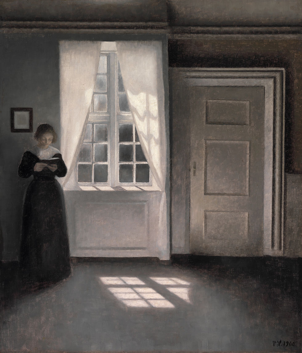
Wall art should match the cuisine's emotional register, not its surface theme. A natural-wine bar serving small plates does not need vineyards on the wall. It needs the feeling of small, slow, considered things — a 1920s Cassatt drypoint, a Hokusai print of a single wave, an Anders Zorn etching of a single figure.
A steakhouse does not need cows. It needs gravitas — a Sargent portrait at scale, a Caravaggio chiaroscuro detail, a Carl Holsøe interior with light coming through a single window.
The cuisine's emotional register is the brief. The subject matter is downstream.
2. Scale is a serving size
The most common restaurant-wall mistake is hanging too small. A 12×16 print floats on a 12-foot wall. The eye reads it as decoration that someone leftover from their apartment.
Restaurant walls want pieces at 24×36 minimum for a single anchor, or a series of three 16×24 prints hung close together. Above the bar, where ceilings are tall, scale up further: 36×48 or even 40×60.
If you are framing for a banquette wall — the wall the guest sits against — go with three medium prints rather than one large one. A guest doesn't want one big composition looming behind them. They want a rhythm.
3. Frame to the room, not to the print
The frame is the link between the painting and the room. A black frame on a Vermeer in a warm wood-panelled restaurant looks rented from a hospital. A natural oak frame on the same Vermeer feels collected.
For most restaurant rooms, the safe frames are:
Matte black for high-contrast, modernist spaces — concrete floors, glass, industrial pendant lights
Natural oak for warm, wood-forward rooms — banquettes, brass fixtures, table candles
Aged brass or champagne for jewel-tone or art deco spaces — green velvet, marble bars
Stained walnut for traditional or Italianate rooms — heavy fabrics, wine displays, dark mouldings
Skip ornate gilt frames unless the entire restaurant is doing a maximalist or salon-style hang. In a single-piece setup, gilt frames read as costume.
4. Avoid the obvious match
A restaurant serving Italian food does not need an Italian Renaissance print. A French bistro does not need an Impressionist café scene. These are the visual equivalent of menu clichés — they confirm what the guest already knows and add nothing.
The strongest restaurant walls do something quieter: a Japanese ukiyo-e print in a Mediterranean restaurant, a Dutch still life in a tapas bar, a Nordic Carl Holsøe interior in an Italian wine bar. The cross-cultural pairing makes the room feel curated rather than themed.
What to avoid
These are the four most common mistakes I see in independent restaurants:
Trend art. Mass-produced abstract prints, neon signs with restaurant puns, framed line drawings of cocktail glasses. These date fast and make the room feel like a hundred others.
Stock photography. A black-and-white photo of a Parisian café printed at restaurant scale. It looks like a stock library because it is one.
Owner's vacation photos. Personal art is rarely strong enough at restaurant scale. It also tells guests this is your space, not theirs.
The single small piece. One 12×18 print on a long wall reads as an afterthought. If you can't afford or commit to a large anchor, do a tight series of three small pieces or skip the wall entirely.
A process I recommend for the wall behind the bar
If you are starting from scratch with one focal wall — the bar back, the entry feature, or the main dining-room anchor — this is the brief I'd give:
1. Take a photograph from where the guest will sit. Not where the host stands. Where the guest will spend forty minutes looking at the wall. 2. Identify the room's emotional register in one phrase. "Slow Sunday lunch." "Loud cocktail bar at 9pm." "Family-run, three-generations-old." That phrase becomes the brief. 3. Pick a single anchor, not three medium pieces. For a bar back or feature wall, one large piece (36×48 or larger) does more than three medium ones. Resist the urge to "fill" the wall. 4. Frame the painting to the room's wood, metal, and light. Match the dominant warm-tone or cool-tone element. If the bar is brass, the frame is brass or aged gold. If the floor is concrete, the frame is matte black. 5. Hang at seated-eye-level for the bar. The centre of the artwork should be roughly 57 inches from the floor for a standing bar; 50–52 inches for a seated dining room.
A single well-chosen piece, well-framed, hung at the right height, in the right scale, will outperform three random pieces in nine restaurants out of ten.
Where the prints come from
The archive at Zocine Art Design holds Vermeer, Caravaggio, Holsøe, Sargent, Cassatt, Hokusai, Zorn, Hammershøi and a wide range of others — printed at restaurant scale, framed to your room's finishes, and shipped framed.
For a restaurant wall, we recommend booking a free consultation. Send us a photograph of the wall from the guest's seat plus three sentences about the room (cuisine, ambient lighting, the emotional register), and we'll recommend three specific pieces with size and frame finish for each.
Key takeaways
The most important wall in a restaurant is not the entry wall — it's the wall behind whatever the guest is looking at while they eat.
Match the cuisine's emotional register, not its surface theme.
Scale up. 24×36 minimum for a single anchor, 36×48 for above-the-bar.
The frame is the link between the painting and the room. Match it to the wood, metal, and light already in the space.
Avoid the obvious cultural match (Italian print + Italian restaurant). Cross-cultural pairings feel curated.
Get a personalized recommendation
If you operate a restaurant, café, hotel lobby, salon, dental office, or boutique, the Zocine Art Consulting service is free for first-time enquiries.
Send us a photograph of the wall you want to fix and three sentences about the room. Within 48 hours you'll receive three recommended pieces — print and frame specified — that fit the room you actually have, not the one we'd like to imagine.
The archive lives at zocineartdesign.etsy.com.


Comments