Wall Art for Co-Working Spaces: Inspiration Without Distraction
A co-working space holds a moving population (designers, writers, sales teams, solo founders, the occasional architect), all of them facing a laptop screen for six to nine hours at a stretch. The wall art behind them has to perform a paradox. It has to suggest the larger world outside the screen (the reason someone left their apartment to work somewhere else), and it has to stay quiet enough not to compete with the screen itself. A loud abstract canvas above the long communal table is the wrong answer in both directions: it doesn't suggest the world, and it does compete with the work.
The right register is the museum reading room. Paintings of horizon (open water, mountain ranges, working harbours) sit in peripheral vision and read as space-extension. They make the room feel three times larger than it is. The seven paintings below carry that brief across four countries and 250 years.

The composition rules
Three rules before the paintings. One: horizon lines, not figures. The wall opposite the desks should read as distance. A landscape, a seascape, or an architectural interior pulls the eye past the screen into implied space; a portrait or a busy genre scene puts a second face into the room and makes the work harder. Two: muted palette. A co-working space reads cool, with neutral cabinetry, glass partitions, plants, and daylight tubes. The art should match that palette, not fight it. Three: one statement piece, the rest quiet. Hokusai's Great Wave at the entrance can be loud; the corridor sequence and the focus-room walls should drop into Hammershøi register.
1. Hokusai, The Great Wave off Kanagawa (c.1831)
The entrance wall. The Great Wave is the single most reproduced image in modern decor for a reason: the wave reads at any scale, the palette is built from three colours (Prussian blue, white, and a touch of pale yellow), and the implicit motion (a wave caught at the half-second before it breaks) suggests momentum without explicitly preaching it. A 1.2-metre print above the reception desk or the entrance bookshelf does the welcoming work that a corporate logo cannot.
2. Van Gogh, Starry Night (1889)

Van Gogh's Starry Night is the second wall: the long break-room wall or the wall behind the lounge sofas. The painting is loud in colour but contemplative in subject. The composition reads as motion (the swirling night sky) over stillness (the sleeping village below). For a co-working space where people take twenty-minute breaks from intense screen work, the Starry Night is the right break-room anchor: it pulls the brain out of the spreadsheet without demanding analytical attention.
3. Caillebotte, The Floor Scrapers (1875)

Caillebotte's Floor Scrapers is the most quietly powerful painting of work in nineteenth-century French art. Three labourers in a Parisian apartment scrape varnish off a wooden floor in long, parallel strokes. They are bare-chested, in deep concentration, completely unaware of the viewer. The painting holds the entire register of focused, repetitive, skilled labour: exactly the mental state co-working users are trying to enter. Hang it in a focus-room corridor or beside a quiet phone booth.
4. Hammershøi, Interior with Sun on the Floor
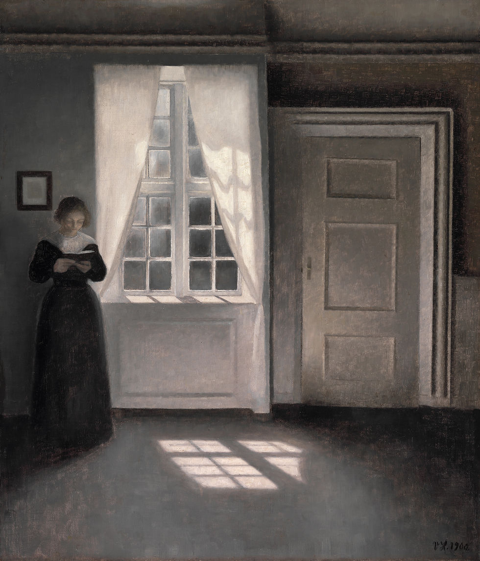
Hammershøi's empty Copenhagen interiors are the canonical paintings of quiet. The walls are pale grey, the floor is bare wood, a single rectangle of north-window light falls across the floorboards. There is no figure, no narrative, no motion. The painting reads as the architectural equivalent of a held breath. Hung in a focus room or a phone booth, it extends the small enclosed space out into a quieter, larger one.
5. A classical landscape: Ruisdael or Cuyp
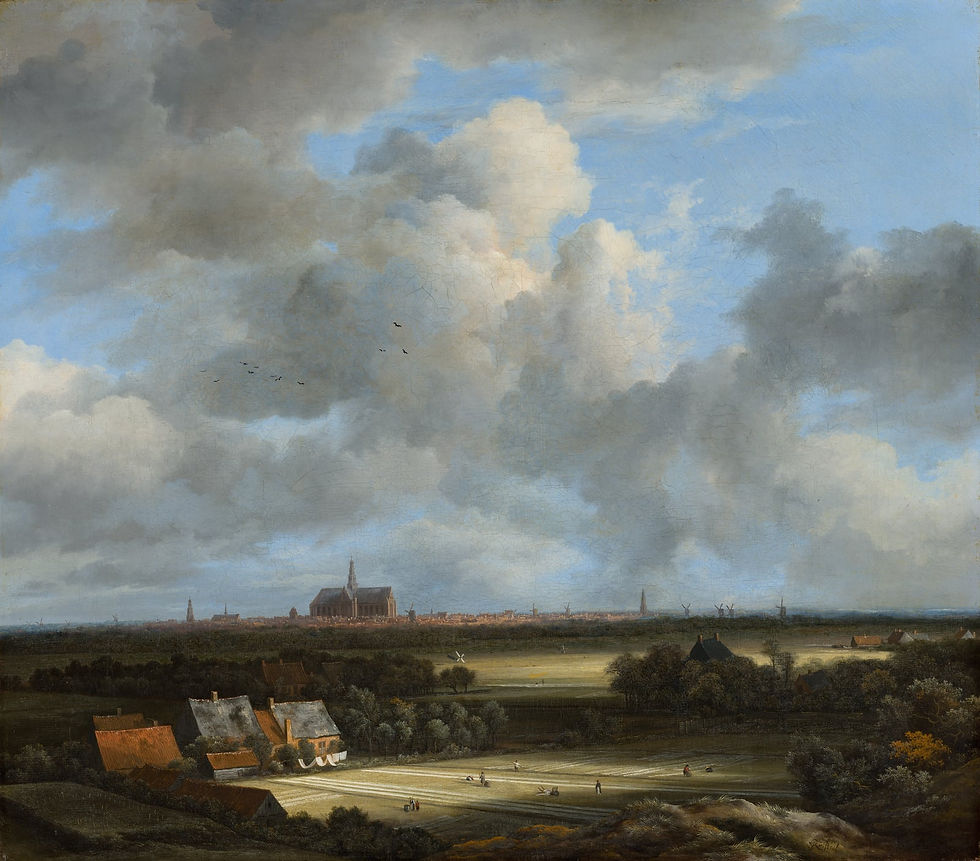
Seventeenth-century Dutch landscape painting is the foundational source for the modern reading-room aesthetic. Jacob van Ruisdael's dark forests with broken windmills, Aelbert Cuyp's golden afternoon light along the Maas, Meindert Hobbema's bright avenues of trees, all of them carry the right horizon-line restraint for a co-working corridor. The palette (olive green, slate blue, butter yellow, brick red) sits well against modern industrial finishes. A single 1-metre Ruisdael landscape at the end of a corridor reads as a window onto a calmer century.
6. Friedrich, Wanderer above the Sea of Fog (1818)
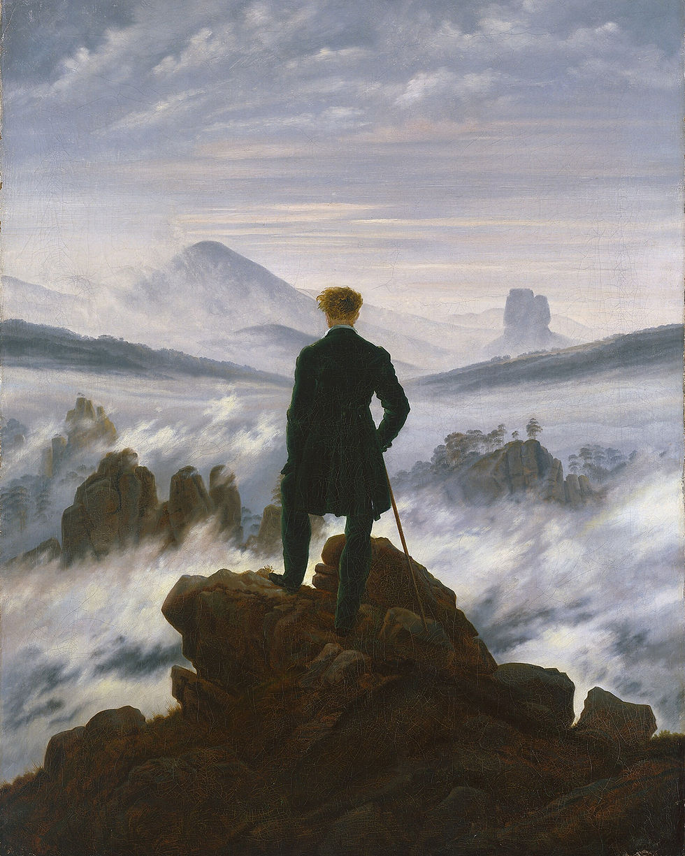
Friedrich's Wanderer is risky in a co-working space because it is too obviously motivational: the lone figure with his back turned, looking out over the fog, has been used in a million tech-startup mood boards. Used carefully, at modest scale and in a less-trafficked corridor, the painting still works because the figure is small, the landscape is enormous, and the message is contemplative rather than triumphant. Avoid hanging it above the communal long table where it will read as corporate cliché; place it instead in a single quiet office or focus room.
7. A Japanese ink landscape

The seventh slot is for the quietest wall in the space, usually the wall behind a single meditation room, a small kitchen, or the entrance to the restrooms. A Japanese ink landscape (Hasegawa Tōhaku's pine trees, Sesshū Tōyō's winter landscape, or a contemporary reissue of an Edo-period sumi-e ink drawing) holds the register exactly. The palette is monochrome (ink black, gradations of grey, the cream of unpainted paper). The composition is sparse, asymmetric, and contemplative. The print should be small and framed in plain dark wood with a generous cream mat.
Composing the space
For the entrance: one large statement (Hokusai, Van Gogh) at reception height. For the communal long table: nothing on the wall directly above the screens. Instead, a long horizontal classical landscape or seascape mounted at the far end of the table, drawing the eye through the length of the room. For focus rooms and phone booths: single small Hammershøi, Caillebotte, or Japanese ink print at sitting eye-level. For corridors: sequence of three to four matching prints in identical pale-oak frames, equally spaced. For the break room: the loudest piece allowed (Starry Night or Friedrich Wanderer), since the break room is exactly where the brain is allowed to wander.
Frame everything in the same finish (pale oak or natural maple is the standard for modern workspace design) so the art reads as one curated collection across the whole space rather than individual decisions.
Key takeaways
Co-working wall art has to inspire without distracting. Horizon lines and landscapes, not faces or busy gallery walls.
Seven paintings carry the brief: Hokusai (Great Wave), Van Gogh (Starry Night), Caillebotte (Floor Scrapers), Hammershøi (Interior with Sun), classical Dutch landscape, Friedrich (Wanderer), Japanese ink landscape.
Compose by zone: one statement at the entrance, quiet sequences in corridors and focus rooms, the loudest piece in the break room.
Single frame finish across the space (pale oak or natural maple) makes the art read as one curated collection.
Featured prints
Hokusai, The Great Wave off Kanagawa: zocineartdesign.etsy.com/listing/1265846485
Van Gogh, The Starry Night: zocineartdesign.etsy.com/listing/1719851473
Hammershøi, Interior, Sunlight on the Floor: zocineartdesign.etsy.com/listing/1145509895
Friedrich, Wanderer above the Sea of Fog: zocineartdesign.etsy.com/listing/962847872
For a curated proposal tailored to your specific co-working floorplan, the consulting service at zocineart.com/art-consulting can scope the full programme.


Comments