Hotel Lobby Wall Art: Six Paintings That Hold a Space Designed to Be Walked Through
Updated: 4 days ago
A hotel lobby is the rare commercial interior where wall art is read by a moving audience at varying distances over a four-to-fifteen second window. Guests enter through the front door at approximately eight to twelve metres from the reception counter, walk that distance while reading the room, and either look up at the wall during check-in (an additional two to five seconds) or turn their attention to the staff and the screen. The wall art therefore has to do two things: register a compositional centre from across the room at first sight, then reward a closer second look during the stationary check-in moment. The six paintings below are chosen for those constraints. Each carries a large legible compositional focal point that registers at distance, a controlled palette that survives both the strong daylight from the entrance and the warm evening lamp-light most boutique hotels use after sunset, and subject matter that signals the property's positioning (heritage, quiet luxury, cultural seriousness) without spelling it out in words.

1. Botticelli, Birth of Venus (c. 1485) — the reception statement
The Botticelli is the canonical large-format hotel reception painting because it carries the highest possible visual recognition + horizontal landscape composition + ambient warm chromatic register. The 172.5 × 278.5 centimetre original is in a Florence collection; a high-quality print at 100 × 160 cm framed in dark walnut sits as the single focal point of a reception wall behind the front desk. The image registers in approximately one second from a guest standing at the front door eight metres away — Venus's pale-pink body on the warm cream-and-blue ground reads as a single compositional shape at distance — and rewards the second look at one metre during check-in (the wind-god Zephyrus and Aura's intertwined figures upper-left, the hours-of-spring Horae at the right with the embroidered cloak, the small individual flowers floating across the painting's surface). The painting is not subtle; it is not asking to be subtle. Reception spaces benefit from one large legible statement rather than three medium-scale subtleties.
2. Cassatt, Tea (c. 1890) — the small lounge or corridor placement
Cassatt's Tea is the small-room counterpart to the Botticelli statement. Print at 60 × 90 cm and frame in black-stained European ash. The painting belongs not on the main reception wall (too quiet to compete with the Venus at distance) but on the wall of an adjacent guest lounge, the corridor leading to elevators, or the alcove off the lobby with the complimentary tea-and-coffee station. The placement makes the painting a small editorial joke: a domestic-interior canvas of two women taking tea hung above the actual tea-and-coffee service guests can use. The joke is gentle and registers only on the second visit — guests who pause to make tea on day two notice the painting's subject for the first time. The Cassatt rewards small-room mounting in a way the Botticelli does not.

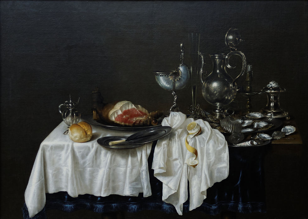
3. Heda, Still Life with Nautilus Cup (c. 1640) — the bar or restaurant entrance
Willem Claesz Heda's monochromatic still lifes are the canonical Northern European seventeenth-century paintings for the hotel-restaurant or hotel-bar entrance. The Nautilus Cup canvas of c. 1640 — a half-eaten meal arrangement on a polished wooden table with overturned silver tazza, lemon with its peel coiled, green-glass römer wine glass, polished pewter plate, the title's nautilus-shell cup — at 60 × 90 cm in dark walnut or stained ash is the cleanest signal a hotel can give that its restaurant takes food seriously without committing to a specific cuisine. The painting works because seventeenth-century Dutch still life was itself the original commercial-interior wall art: the canvases were painted for the dining rooms of wealthy Amsterdam merchant houses, sized for above-sideboard placement, and intended to be read at exactly the conversational distance a guest is at when seated at a restaurant table or at the bar. The Heda transfers cleanly to twenty-first-century boutique hotel restaurant placement.
4. Hammershøi, Interior, Strandgade 30 (1900) — the elevator-landing quiet
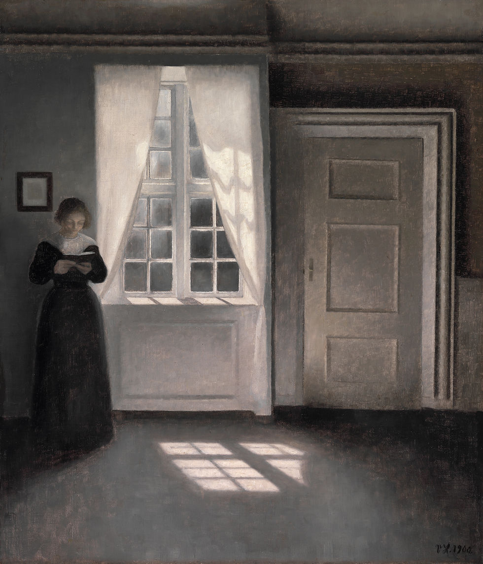
The Hammershøi is the painting that signals quiet luxury rather than the more typical luxury-hotel signal of saturated colour and gilt. Print at 50 × 70 cm in unstained European oak and mount on the wall opposite the elevator doors at every floor landing of a boutique hotel. The painting's argument — an empty room with a single back-turned figure walking through it, the room cool grey and dove white with a splash of yellow afternoon sun on the floor — rewards the seven-to-twelve second window a guest spends waiting for an elevator. The repetition of the same image at every floor produces a kind of architectural rhythm: guests come to associate the hotel's vertical circulation with the same quiet visual moment. The painting is the inverse of luxury-hotel-art conventions. It works precisely because it is not what a guest expects to find at an elevator landing.
5. Vermeer, The Milkmaid (c. 1660) — the elevator-cab interior
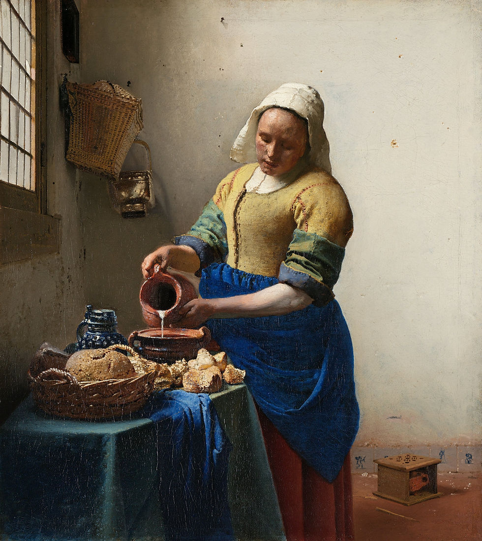
Vermeer's Milkmaid is small enough (the original is 45.5 × 41 cm) to work inside the interior of an elevator cab. Print at 40 × 35 cm and frame in dark walnut with a narrow brass inner liner; mount centred on the back wall of the cab at approximately 145 cm height (seated-eye-level for the unusual case of a guest who has used the bench seat, standing-shoulder-level for the typical use). The painting is in the cab for the eight-to-thirty second window of a typical hotel elevator trip — enough time to register the painting's quiet domestic ritual, not enough time to lose interest. The Vermeer is also one of the few paintings durable enough as an editorial choice to bear repeated viewing by the same guests across the duration of their hotel stay. A guest who takes the elevator five or six times across a three-night stay accumulates a small but real relationship to the painting by the morning of departure. The hotel that places a Vermeer in its elevator cab is signalling something specific about its understanding of its own guests' attention spans.
6. Caravaggio, The Calling of Saint Matthew (1599-1600) — the conference-room major statement
Caravaggio's Calling of Saint Matthew is the alternative reception statement to the Botticelli, for hotels whose positioning sits at the more-serious cultural-heritage end of the boutique market. Print at 120 × 150 cm in dark walnut and mount as the single focal point of the hotel's conference-room or private-event-space wall. The painting's argument — a Roman tax collector and his small group of card-playing collectors illuminated by a single beam of daylight from upper-right that does not come from any visible window, with Christ's figure standing in the deep shadow at the right of the canvas pointing across the table at Matthew — registers at distance as a sharply-lit figural group and rewards the second look with the painting's actual subject (a moment of religious vocation interrupting a financial transaction). The painting reads as cultural seriousness without saying so explicitly; a boutique hotel that hosts wedding receptions, corporate retreats, or small academic conferences finds the Caravaggio carries the room without committing to any specific institutional register.

Placement, framing, and lighting — the practical rules
Three rules govern all six placements. First: lighting. Every painting on a hotel wall should be lit by a dedicated frame-mounted or wall-washer LED at approximately 2700-3000 Kelvin colour temperature — warm enough to match the lobby's evening incandescent light, cool enough to render the painting's actual chromatic range. The single most-common boutique-hotel art mistake is hanging a painting and not lighting it; an unlit painting at evening hours reads as a dark rectangle and contributes nothing to the room. Second: framing. Pick ONE frame material across the entire hotel — dark walnut, black-stained ash, or unstained European oak — and use it for every painting in the property. Visual coherence between frames matters more than perfect fit to each individual painting. The hotel-wide frame system signals craft and intentionality in a way no individual painting can. Third: scale. The reception-wall statement (Botticelli or Caravaggio) needs minimum 100 cm long-edge dimensions. The lounge, corridor, bar, and elevator placements work at 60 × 90 cm or 50 × 70 cm. The cab placement works at 40 × 35 cm. Hotels that get the proportions right look professionally art-consulted even when they have spent under a thousand dollars on the entire art programme.
Key takeaways
A hotel lobby is read by a moving audience at varying distances over a 4-15 second window. Wall art has to register at the front-door distance (8-12 m) AND reward the second look during the stationary check-in moment (2-5 s). Two-stage attention is the design constraint.
Six paintings + placements: Botticelli Birth of Venus (reception wall behind front desk, 100×160 cm), Cassatt Tea (tea-station alcove or corridor, 60×90 cm), Heda Nautilus Still Life (restaurant or bar entrance, 60×90 cm), Hammershøi Strandgade Interior (elevator landings at every floor, 50×70 cm), Vermeer Milkmaid (elevator cab interior, 40×35 cm), Caravaggio Calling of Matthew (conference/event-space wall, 120×150 cm).
Three universal rules: (1) LIGHTING — every painting lit by dedicated 2700-3000K LED frame light or wall-washer; an unlit painting at evening reads as a dark rectangle. (2) FRAMING — pick ONE frame material for the entire hotel (dark walnut OR black-stained ash OR unstained oak). Visual coherence between frames > perfect individual fit. (3) SCALE — reception 100+ cm long-edge, lounge/corridor/bar 60×90, cab 40×35.
Hub D classical-art programming costs under $1,000 for a six-painting set (high-quality fine prints + appropriate frames + LED frame-lighting kits) versus $5,000-$50,000 for the contemporary-art commission an art consultant would otherwise propose. The cost gap is the boutique hotel's structural advantage.
The Cassatt-above-the-tea-station joke and the Vermeer-in-the-elevator-cab visual durability are the two repeatable editorial moves that signal art-consulted intentionality. Guests who notice these moves on the second day of their stay produce the social-media and review-site mentions that drive the boutique hotel's organic discovery channel.
Two reception-statement alternatives: Botticelli Venus (heritage / craft / warm-luxury positioning) OR Caravaggio Calling of Matthew (cultural-seriousness / conference-and-event-hosting positioning). Pick the one that matches the hotel's actual booking pattern — the painting that matches the hotel's real guest mix outperforms the painting the property's owner personally prefers.
Specifying art for a hotel, restaurant, or commercial space? Send room photos via our consulting service — free consultation, custom shortlist, framed-and-shipped delivery. Browse the full archive of fine prints at zocineartdesign.etsy.com.
New in the Journal: Bedroom Wall Art for Couples: Six Paintings That Don't Argue With Each Other


Comments