10 Ways to Decorate a Large Wall (Without Filling It with Furniture)
- Zocine Art
- May 26
- 5 min read
A large blank wall is the most editorial canvas in any home. It carries scale, sightline, and tone in a way no shelf or sideboard can. Decorating it well is less about covering the wall and more about composing it — the way a curator hangs a single room at a museum.
The instinct most rooms get wrong is to fill the empty wall with more furniture. The better approach is to treat the wall itself as the architecture, and let one carefully chosen arrangement of art carry the weight.
Below are ten ways to do it, each pulled from how the best gallery rooms, salon hangs, and editorial interiors actually solve the problem. They are arranged from the most reductive — one print, large, alone — to the most layered, where art and shelving merge into a built-in library. Pick the one that matches your room's geometry first, then your taste.
1. Anchor with a single oversized statement print
The simplest move and often the strongest. One large framed work — sized to roughly 60 to 75 percent of the wall's available width — set centered, with breathing room above and below.
This works because the eye reads scale before it reads subject. A 36 × 48-inch Hokusai or a wide Hiroshige seascape behind the sofa instantly tells the room what kind of space it wants to be. The frame matters: matte black or warm oak, never glossy, never too thin.
2. Build a salon-style gallery wall
Borrowed from the 18th-century Paris Salons, where paintings were hung floor-to-ceiling in dense, varied compositions. The modern version is calmer but follows the same rule: mix sizes, mix frames, repeat one element to hold it together — usually a consistent frame finish or a recurring color across the works.
A salon wall reads as a personality, not a decoration. The goal is the feeling of a room that has collected art over time, not a single shopping trip.
3. Lay a triptych across the horizontal
Three vertical prints, equal in size, hung in a row with about 8 to 12 cm of breathing space between them. The eye reads it as a single panoramic composition. It's the formula behind almost every museum-style hallway and most editorial dining rooms.
Hokusai's 36 Views of Mount Fuji and Hiroshige's 53 Stations of the Tōkaidō were made for this — they are a series, built to be read in sequence. Pick three views from the same set and you have an instant triptych with internal narrative.
4. Stack a vertical column for tall walls
Double-height living rooms, stairwell walls, and entryways with extra ceiling all suffer the same problem: a normal-sized print floats helplessly halfway up. The fix is a stacked column — two or three pieces hung vertically, closer together than feels natural, treated as one tall composition.
The lowest piece sits at the room's natural sightline. The pieces above it climb the wall, scaling it. The frame finish should be identical across the stack to keep the column readable as one element.
5. Try the museum diptych
Two same-size pieces, identically framed, hung 8 to 12 cm apart. Used to anchor dining rooms, bed walls, and any space where symmetry is doing structural work.
A diptych is especially strong with two pieces by the same artist that share a palette or sitter. Two portraits of the same period. Two landscapes from the same series. The repetition is the point — it reads as deliberate, almost archival.
6. Pair the wall with a tall console — the leaning approach
Place a slim console or sideboard against the wall and lean — don't hang — two or three prints of different heights against it. Add one ceramic object, one small lamp, one stack of books. The composition feels collected, not arranged.
This is the trick interior photographers use to make a wall feel like it belongs to a person. The lack of nails reads as confidence: the art is here for now, ready to move.
7. Use a single horizontal panorama over the sofa
For long sofas and low ceilings, the strongest move is a single wide panoramic painting — landscape orientation, sized to roughly the width of the sofa's back. The eye reads horizontality and the room widens.
The classics here are Hiroshige's Whirlpool at Awa, Bierstadt's western vistas, and Monet's water lilies panels. Anything where the horizon line carries the composition.
8. Mix art with shelving — the open library wall
Built-in shelves combined with three or four framed works leaning between the books. Add small sculptural objects — a brass bowl, a clay vessel, a stack of bound essays. The art lives among the books rather than over them.
This works because it sidesteps the binary choice between bookcase and gallery wall. The wall becomes a layered surface — readable up close, composed from across the room.
9. Pair botanical with figurative
Two pieces, side by side, but from different genres. A Henri Rousseau jungle next to a Mucha figurative. A Dutch flower still life beside a Sargent portrait. The contrast makes both pieces sharper — the botanical reads quieter, the figurative reads more present.
The rule: match the frame finish and one tonal element across the two works. The eye needs one shared note to read them as a pair.
10. Hang one work alone — radical minimalism
The most editorial choice. A single small piece, centered on a vast empty wall, the surrounding wall left bare. It reads as confidence. It reads as a museum.
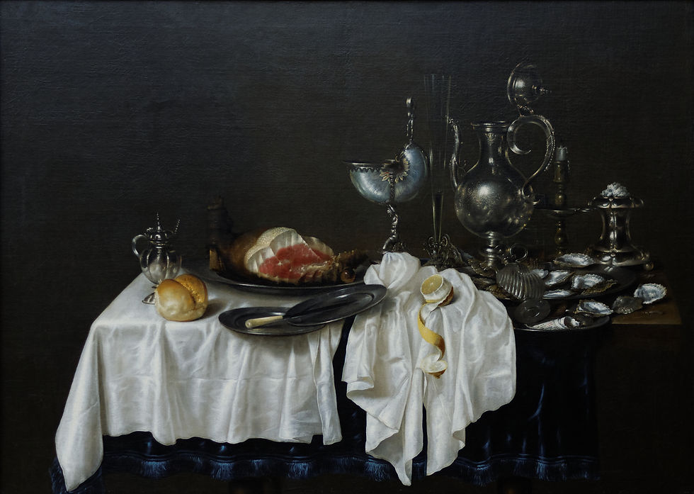
It only works with the right piece — usually something dark, painterly, with internal weight. Albert Aublet's Selene, a Caravaggio still life, a Vermeer interior. The size of the work matters less than its presence.
Choosing which approach fits your wall
A few short rules from gallery installation:
Measure the wall first, then the sofa or bed it sits above. The art should be about two-thirds the width of the furniture, never narrower.
Hang at eye level — center of the work around 145 to 155 cm from the floor. The instinct to hang higher is almost always wrong.
Choose one frame finish and repeat it across the wall. Mixed frames work only when the mix is intentional and the wall is dense.
Light the art directly when possible. A picture light or a track spot transforms how a print reads after sunset.
A large wall, well composed, is the only piece of decor in a room that gets stronger as the years pass. The furniture changes; the art stays.
Featured prints from this guide
Key takeaways
One oversized print, sized to the wall, is the strongest single move.
Triptychs and diptychs let you scale art with symmetry and series logic.
Salon walls, library walls, and console leans add layered, lived-in depth.
Radical minimalism — one small framed work alone — reads as the most editorial choice.
Frame finish, sightline height, and breathing space matter as much as the work itself.
Browse the full archive at zocineartdesign.etsy.com — fine prints from the canon, well framed, sized for the wall they will live on.


Comments