Eight Paintings for the Reader's Wall: Classical Pairings for the BookTok Library
- Zocine Art
- 6 days ago
- 8 min read
BookTok's classical literature revival has filled bedside tables and reading shelves across two reader generations with Dostoyevsky's Crime and Punishment, Camus's L'Étranger, Wilde's The Picture of Dorian Gray, Tolstoy's War and Peace, Plath's The Bell Jar, and Kafka's The Trial — the canon TikTok has rediscovered and the shelf the millennial-and-Gen-Z reader builds first. The eight paintings below are chosen as wall-art pairings for that shelf. Each painting was selected because it answers the specific emotional register of one specific classical novel — the way Goya's Saturn answers Dostoyevsky's Raskolnikov, the way Friedrich's Monk by the Sea answers Camus's Meursault. When the painting on the wall and the novel on the bedside table operate in the same register, the reading room stops reading as a decorated room with books on a shelf and starts reading as the reader's actual interior. That is the room the BookTok-coded reader is trying to build.

1. Goya, Saturn Devouring His Son (c. 1820-23) → Dostoyevsky, Crime and Punishment (1866)
Goya's Saturn is the wall painting for the reader of Dostoyevsky's Crime and Punishment. The c. 1820-23 Black Painting (originally painted directly onto the plaster of Goya's dining-room wall in his Madrid country house, transferred to canvas after his death) depicts the Titan Saturn devouring the dismembered body of his own son to prevent the prophesied overthrow. The painting and the novel share a single subject: a soul consuming itself in advance of a punishment it both fears and invents. Raskolnikov's mathematical justification of murder is Saturn's mathematical fear of succession. Both works are about the male intellect eating itself in the cellar at three in the morning. Print at 50 × 90 cm vertical, frame in black-stained ash, mount above the reading chair — not above the shelf where guests can see, but in the corner where the reader actually sits. The Goya is for the serious Dostoyevsky reader; it should not be hung in any room where small children eat dinner.

2. Friedrich, The Monk by the Sea (1808-10) → Camus, The Stranger (1942)
Friedrich's Monk by the Sea is the canonical wall painting for the reader of Camus's L'Étranger. A single figure in a dark Capuchin habit stands at the lower-left edge of an emptied beach and faces an indistinct horizon across a flat black sea under an enormous overcast sky that occupies four-fifths of the canvas. The painting was considered scandalous in 1810 specifically because it refused to provide a religious or narrative resolution — the monk faces the sea, the sea does not face him back, the painting does not pretend that the encounter means anything. Camus's Meursault on the Algiers beach under the same sun is the same figure. Both works are exact statements of the absurdist position: meaning is asked for, the universe declines to answer, the figure remains. Print at 70 × 100 cm horizontal, frame in slim unstained European oak, mount above the reading shelf at standing-eye height. The Friedrich rewards the reader who has finished Camus and wants the painting to keep saying what the novel said.
3. Klimt, Portrait of Adele Bloch-Bauer I (1907) → Wilde, The Picture of Dorian Gray (1890)
Klimt's gold-saturated portrait of Adele Bloch-Bauer is the wall painting for the reader of Wilde's Picture of Dorian Gray. Both works share a single thesis: a gilded surface conceals an interior that the surface is desperately working to deny. The 138 × 138 cm canvas, painted between 1903 and 1907 across four years of obsessive surface-decoration, renders Adele in a position of opulence — gold-leaf background, gold-embroidered dress, gold throne, eyes turned slightly to the right with a held, almost-suppressed expression. The reader who has finished Wilde's Dorian Gray knows what the surface is hiding. The painting reads at distance as warm decoration and rewards close looking with the specific anxiety the gold is performing. Print at 80 × 80 cm square, frame in slim gold-leaf European oak (matching the painting's own register), mount in the library above the desk or beside the bookshelf. The Klimt is the strongest wall pairing for the late-Wilde reader who has read the novel for what it actually is rather than for what it looks like.

4. Friedrich, The Sea of Ice (1823-24) → Tolstoy, War and Peace (1869)
Friedrich's Sea of Ice is the wall painting for the reader of Tolstoy's War and Peace. The 1823-24 canvas depicts the wreck of a polar exploration ship (commonly identified as the British HMS Griper) crushed by an enormous heave of sea-ice slabs — the masts of the wrecked ship protrude almost invisibly from the right edge, dwarfed by the ice. The painting is the strongest Western visual statement of civilizational scale-loss: the human enterprise (a ship, a navy, an exploration) reduced to scattered fragments by a single geological event. Tolstoy's novel performs the same operation in prose — Napoleon's army of 600,000 men entering Russia and the same army (now 27,000 men, frozen, deserted, broken) leaving five months later. Both works share a thesis: history is not what generals think it is. Print at 80 × 120 cm horizontal, frame in dark walnut, mount in the library above the reading shelf or in the hallway on the way to the library. The Friedrich is for the reader who has finished Tolstoy and understood why the second half of the novel is the better half.

5. Cézanne, Mont Sainte-Victoire (c. 1904) → Hemingway, The Old Man and the Sea (1952)
Cézanne's late Mont Sainte-Victoire is the wall painting for the reader of Hemingway's late prose. Both bodies of work share a single principle: return to one geography, refuse decoration, render the subject with the minimum number of structural elements required for it to remain itself. Cézanne painted the limestone mountain east of his Provence studio more than sixty times between 1882 and his death in 1906; Hemingway's late Cuba sentences strip the prose to the load-bearing fishing-line. Both artists believed restraint was the form of seriousness. The c. 1904 painting dissolves the mountain into structured colour-patches of ochre, sage-green, and lavender-violet — the patches refuse to fill in, the way the late Hemingway sentence refuses to add the adjective. Print at 70 × 90 cm horizontal, frame in slim unstained European oak, mount above the reading shelf. The Cézanne is the wall pairing for the reader who likes Hemingway specifically for what Hemingway leaves out.

6. Böcklin, Isle of the Dead (1880-86) → Plath, The Bell Jar (1963)
Böcklin's Isle of the Dead is the wall painting for the reader of Plath's The Bell Jar. A pale-coated figure in a small black boat approaches a vertical limestone island ringed with funereal cypress trees; the painting is rendered five separate times across 1880-86 in five small variations, each in subtly different evening light. The painting is the strongest Western image of the closed bell of melancholic suspension — the state Plath's Esther Greenwood describes when the bell descends and the world's sounds go muffled. Both works are about a single female interior holding still inside an enclosure that no one else can see. Print at 60 × 80 cm horizontal, frame in dark walnut with a narrow black-cloth mount, mount in the bedroom above the dresser or in the reading nook. The Böcklin is a quiet wall companion for the reader who has been through the bell themselves and is now reading Plath as recognition rather than as introduction.

7. Bosch, Garden of Earthly Delights (c. 1490-1510) → Kafka, The Trial (1925)
Bosch's Garden of Earthly Delights is the wall painting for the reader of Kafka's The Trial. Both works share a structural premise: the world is a fully-functional bureaucratic machine that follows a coherent internal logic the protagonist cannot access from inside it. Bosch's triptych depicts paradise, the garden of pleasure, and the punishment hellscape as a single continuous Renaissance theological-bureaucratic system; Kafka's K. enters a city-wide juridical machine that operates on the same internally-coherent-yet-inaccessible principle. Both works refuse to translate themselves for the viewer. The painting reads at distance as a busy figure-crowded mediaeval surface and rewards close looking with the specific punishment-mechanism logic of each individual hellscape element. Print the right-hand hellscape panel at 50 × 90 cm vertical, frame in dark walnut, mount in the reader's home-office or above the work-desk. The Bosch is the wall pairing for the reader of Kafka who has worked inside a corporate legal department and recognised the architecture.

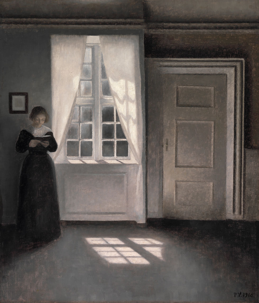
8. Hammershøi, Interior, Strandgade 30 (1900) → Woolf, Mrs Dalloway (1925)
Hammershøi's Interior, Strandgade 30 is the wall painting for the reader of Woolf's Mrs Dalloway. A single woman in a high-collared dark dress is seen from behind, standing at a door in a quiet Copenhagen apartment interior, surrounded by cool grey light, an empty parquet floor, an empty table, a closed second door. The painting is the strongest Northern-European visual statement of the female interior morning — the woman alone in the room, the room alone in the city, the city briefly indifferent to the woman. Woolf's Clarissa Dalloway buying flowers and walking through London on a single June morning operates in the exact same emotional register. Both works share a thesis: the interior life is enough. Print at 60 × 75 cm vertical, frame in unstained European oak, mount in the bedroom or in the small reading nook. The Hammershøi is the calmest wall pairing in this series and the most useful for the reader who returns to Woolf year after year for the prose itself rather than for the plot.
How to mount the painting in the BookTok library room
Three practical rules govern the reading-shelf wall. First: ABOVE THE SHELF, NOT IN FRONT OF THE SHELF. The painting hangs on the wall above the reading shelf or above the reading chair, not on the wall behind the shelf where it disappears between book spines. The painting needs its own visible surface area. Second: ONE BOOK, ONE PAINTING. Resist the impulse to hang a small grid of four small paintings — the reading wall works on the same principle as the bedside table, one significant object at a time. The grid is for the gallery hallway, not for the reading nook. Third: WARM LAMP, NOT OVERHEAD. The reading room is read in lamp-light, not overhead-light; the painting should be lit by the same warm 2700K lamp the reader uses to read. A painting lit by overhead fluorescent at 4000K reads as the dentist's waiting room. The painting and the books and the lamp must all agree on the same temperature.
Key takeaways
BookTok's classical literature revival has built a specific reading-canon — Dostoyevsky, Camus, Wilde, Tolstoy, Hemingway, Plath, Kafka, Woolf — and the wall above the reading shelf wants a painting that operates in the same emotional register as the books below it.
Eight novel-painting pairings: Crime and Punishment → Goya Saturn. The Stranger → Friedrich Monk by the Sea. Dorian Gray → Klimt Adele Bloch-Bauer I. War and Peace → Friedrich Sea of Ice. Old Man and the Sea → Cézanne Mont Sainte-Victoire. Bell Jar → Böcklin Isle of the Dead. The Trial → Bosch Garden of Earthly Delights (right panel). Mrs Dalloway → Hammershøi Strandgade Interior.
Print sizes: portrait + vertical paintings = 50-70 cm wide; horizontal paintings = 70-100 cm wide. Reading-shelf wall is typically shorter than living-room wall — calibrate to wall width, not to gallery defaults.
Frame guidance: dark walnut for the heavy emotional pairings (Goya, Bosch, Böcklin, Friedrich Sea of Ice). Unstained European oak for the cooler-restraint pairings (Friedrich Monk, Cézanne, Hammershøi). Slim gold-leaf oak for the Klimt only. Black-stained ash for the Goya only.
Three universal rules: (1) ABOVE THE SHELF, not in front of the shelf — the painting needs its own visible surface. (2) ONE PAINTING, NOT A GRID — the reading wall works on the bedside-table principle. (3) WARM LAMP, NOT OVERHEAD — match 2700K warm-white lamp temperature so the painting, the books, and the reader's chair all operate at the same colour-temperature.
Browse fine prints for the reader's library and reading nook in the archive at zocineartdesign.etsy.com.


Comments